"You have to learn the rules before you know how to break them."
I used to hear that line all the time from instructors and co-workers. I never really understood what they meant. Rules are rules and they're there to keep us in line and make our animation look fantastic, right? Right. Mostly. It turns out that there are times when it's okay break the rules; but even then, there are guidelines to help our animation looking sharp.
As animators, we pay a lot of attention to the silhouette of our poses. We want our poses to read clearly, even if the entire character were shaded in with solid black. The character's attitude should still be easy to read from the angle of their head to the individual joints on each of their fingers.
And sure, having a great silhouette is something we should all strive for. But sometimes it's just not practical to have the arms and hands clearly extended from the body. Sometimes the head needs to be tilted down so far that you can’t tell its position in relation to the neck and the rest of the torso, or the hands are placed in front of the body making the silhouette of the fingers disappear. What do you do in these situations?
Why, you rely on the internal silhouette.
Have a look at this pose of Sylvester the Cat.
It’s pretty clear to us that he’s being all sneaky, sly, and mischievous. He probably has evil intentions for that egg he’s cradling away from its nest so gingerly.
But Sylvester’s silhouette is really muddled together. Check out what happens if we apply the old fill-in-the-silhouette-with-black test:
We can’t even tell which direction he’s facing, let alone what his pose is meant to communicate! Still, this pose reads clearly, and here’s why: The internal silhouette is clear.
See, the idea of a silhouette is really about contrasting colors. When we shade a character in with black, we're merely contrasting the character’s shape with the background. Black on white, see?
But if the character design itself uses contrasting colors (Sylvester is a black cat, but his body is white, his cheeks are white, and his hands are white) we can take advantage of that design and get a second level of contrast.
Don’t believe me? Check it out. Here’s that same silhouette, but this time we’ve shaded in all of Sylvester’s white parts to see their shape as well.
Much clearer now, isn’t it? Sylvester's black and white body parts help create a very readable internal silhouette.
That’s one of the reasons the character is designed the way it is. As someone once explained to me: “Why do you think all of those 1920’s and 1930’s cartoon characters wore white gloves?? It was so you could see their hands when they brought them in front of their black bodies!!”
It’s absolutely true. You can even see it in live action. Here’s a shot from American Psycho:
This character’s attitude seems very clear to me. In control, and maybe a bit pompous about it. But here’s the blob of a silhouette we get when we shade him in:
How do we figure out what to make of this big black nothing? Have a look at how the skin tones contrast against everything else:
Now it’s as clear as day!
An even better example can be seen here, in this shot of Jack Lemmon in The Apartment:
Look at how constricted and balled up he is! Is there any way that we could tell what he’s doing just from his basic shape? Nope!
So how do we figure out what’s going on here? Internal Silhouette to the rescue!
Incidentally, if you think that there aren't conscious choices on the part of a director, cinematographer, costume designer, make-up artist, etc. that enhance all of these elements, think again. In a well-crafted film every crew member is paying attention to all of these details to create a frame of film that tells the story in the clearest way possible. Have a look at some of your favorite films and dissect what makes each scene come to life, and then consider all of the people involved in creating that scene. It's a pretty spectacular thing.
*ahem*
Let’s get back to animation.
When we talk about Silhouette, we are mostly talking about a character’s main body pose. We're looking at the spine (the line of action), the head, the legs and feet.
Internal silhouette, it seems to me, often has a lot more to do with hands and smaller gestures.
Check out this pose from the classic “One Froggy Evening”:
The hand is so important to the composition of that shot, it’s not only huge, but it’s bright yellow! You don’t even see anything else close to yellow in that shot. Talk about contrast! The hand practically has its own silhouette apart from the rest of the man’s body.
Here’s one of Porky Pig demonstrating that white glove thing:
Here, Dean opens the door for Hogarth in The Iron Giant:
Even when cast in shadow, that hand shows up really nicely in contrast to his dark burgundy robe.
Speaking of Hogarth, here he is hanging out in Downtown Coolsville:
One hand is in clearly silhouetted by the dark background, and the other shows clearly in contrast with Hogarth’s dark shirt. Note how the two hands, each silhouetted in their own way, work together to read as a single pose.
In the uber-classic “What’s Opera, Doc?” we see Elmer Fudd, whose cuirass almost disappears into the background, but his hands are nice and readable as he plots to get dat wabbit:
The lesson here is that although you should always strive to craft your poses into a clear silhouette, be aware that sometimes "silhouette" can be a more complicated idea. Our eyes don’t see shapes, they see contrasts. Contrasts are what make the shapes.
Use those contrasts to create clear silhouettes and recognize when you can use them to create clear internal silhouettes and you’ll open up a whole new range of what you can communicate with a character’s pose.
Hey guys and gals,
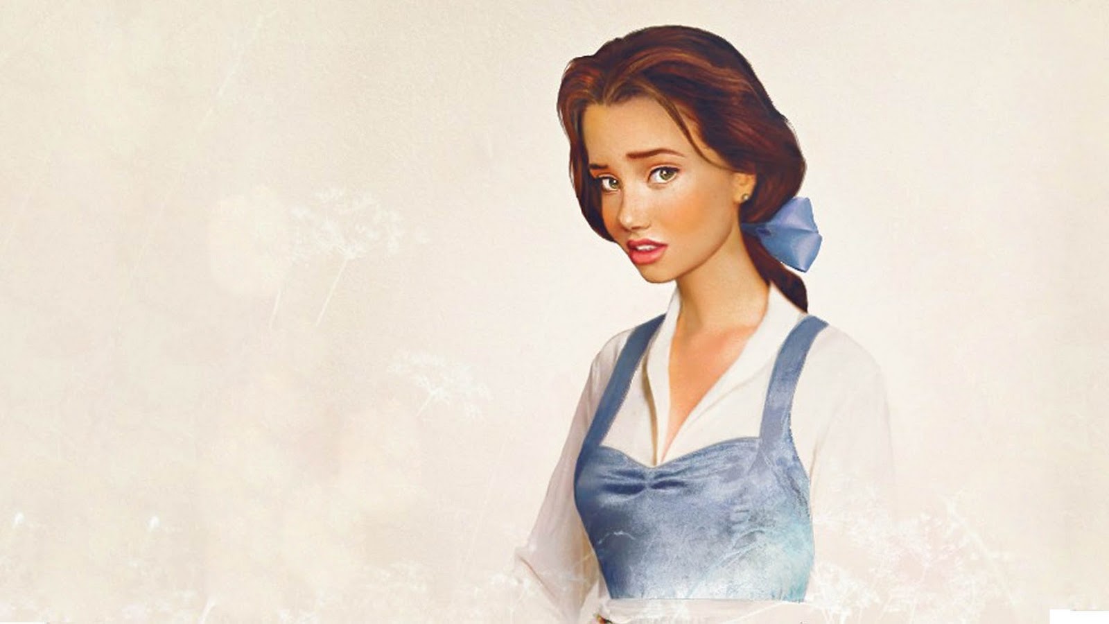
This post is not directly an animation resource, but instead a tribute to the beautiful work of Bournemouth student, Jirka Väätäinen. Using photoshop manipulation, Jirka has brung Disney's portfolio of females to real life. Each artwork seems to have captured the character perfectly. Beautiful work!
To view and enjoy, please click the pic.
Celebrating the festive season, here is the final mini-challenge of 2011.
The work was produced by Ohjin who presents the delight of receiving an unexpected present, while Sureshpadmaraj presents the frustration of trying to catch a runnerway!!
If you wish to leave any thoughts/constructive criticism about the work, please use the comments section.
Once more, from all at the 11SC Blog, hope you enjoy a Merry Christmas!
So, here in Sweden we celebrate Christmas on the 24th (we're about the only country to do that...). We also have a 50 year old tradition of watching a show from Disney at 3PM every Christmas. This is Serious Business, literally one third of Sweden (!!) sits down to watch this show. It includes some golden shorts, like this one:
As a child I LOVED this show. There's this feeling that Christmas doesn't really start until 3pm, when Benjamin invites us to go on a trip through old Disney moments with him. There's also the tradition we had that we opened gifts right after the show was done, but nevermind. ;)
Nowadays as an animator I have a new appreciation for the old Disney shorts. They are amazing! Just look at this one about a certain bull who likes to smell flowers...
So, even if it's a day early for the majority of you... (you shouldn't be at the computer on Christmas anyhow!)
From all of us, to all of you - Merry Christmas!!
(if there is anyone who wanna see the whole show, the first part can be found here!)
Hey guys and gals,
On this post I wish to link to a wonderful AnimSchool interview of Bobby Pontillas. Please click here to read.
Written by Andrew Tran, the interview discusses Bobby's journey from breaking into the industry to Blue Sky Studios, before transferring to work at Disney Studios.
You can also check out Bobby's personal blog by clicking here.
Hello guys and gals,
For those who wish to light and render like the pros, here is a beautiful website with many tutorials on how to approach a scene. Click the image to check it out!
(Many thanks to Iestyn Roberts for the link)
Hey guys and gals,
Understanding beats and timing can be a complicated subject to understand. Here's a great tutorial by Canadian animator, Amir Avni, on how to research and explore the topic, before implementing it into your own work.
Click the image to check it out! Also please don't forget to check out part two!
Hey guys and gals,
From time to time, you may have the opportunity to animate animals. This is particularly the case, should you hope to one day work for leading animation company, Tippett Studio.
Their supervising animation,William Groebe, presents a masterclass on creature animation. He also includes some great advice on what to include in your reel for a job at the studio.
The presentation is a long one, so please grab a cup of tea (possibly a cushion too), then sit back, learn and enjoy. Click the image to check it out!
(Our thanks to Marina Anthony for providing the link)
Hey everyone Jason Schleifer has done a great TEDX talk about developing character and the importance of giving back storys. I hope you enjoy this gem as much as I did.
Hello guys and gals,
This one is a double posting to catch up on what has happened in the last few weeks.
First up is J.K. Riki's entry for the circus challenge. Famous for his Fred the Monkey series, he treats us to some 2d animation. Please click here to see his set of thumbnails.
Second up is Mc 21: the pendulum. Great to see people try Cosmicfool's tutorial, which once again we wish to thank him for. There were a couple of people who took this on and added some nice creativity. Brian Horgon takes us back to the good old days with a tribute to Space Invaders.
Next, Sureshpadmaraj treast us to something a little different. A complex idea, that treats the pendulum as a gatekeeper. 'You shall not past!!!!!... ... ... ok, go on then'. Brilliant!
If you have gotten into a mental rut or just a feeling like giving up because your shots to hard head over to the great blog Animator Letters Project. They are building a collection of great letters to aspiring animators from animators all over. Right from the start they hit you with the best pep talks ever.
"Ultimately, the struggles that we have- the creative blocks we all face- come from comparing ourselves to others. I'm not as good as that person. I'm not as successful as that person. That person is at the level I want to be at and I don't have it in me to get there. I do this constantly. But I realized a few years ago that what I SHOULD be doing is comparing myself to myself." - Steve Anderson, Director of 'Winnie the Pooh'
"To all you who want to be animators..first and foremost, you must find and recognize the same desire to create. Not only for others but to create for yourself. To create for the primal need to just create. Don't create for the sole reason and purpose of entertainment: to make others laugh and cry. Create to appeal to yourself." -Daniel Gonzales III (PIXAR)
One thing I find that often plagues animators that are just starting out, besides forgetting to bathe cause they are animating too much, is composition. What is compositoin you say? Well lets go to the dictionary.
composition is the placement or arrangement of visual elements or ingredients in a work of art or a photograph, as distinct from the subject of a work. It can also be thought of as the organization of the elements of art according to the principles of art.
Well that was wordy and boring...so what does it mean & how does that apply to animation? Composition has to do with where characters/objects are on the screen, within the frame of the shot. Too often than not, I see animators import a couple of rigs, throw in a camera and start animating. But why is the camera there? Why are the characters standing where they are? What is the composition? Why am I asking all these questions? Thought and planning should go into your composition just like it does in your acting choices. When you go see a Pixar movie, they didn't just barf the characters & cameras onto the screen...at least..I hope they didn't. Lots of thought and time goes into where they should be in relation to each other & where the camera should be. Here are some tips, examples, & rules... don't worry there are images, cause reading text is boring.
Fill Your Frame - You don't want the viewer to have to squint to make out what they are looking at. If the character is the focus of your shot...make sure you can see them. Now, sometimes having a character small on screen can be used for dramatic effect, but if this character is talking or doing an important action, make sure we can see em
Rule of Thirds - The basic principle behind the rule of thirds is to imagine breaking an image down into thirds (both horizontally and vertically) You want to place your main points of interest at the intersections or along the lines. Now this is a rule...and if I've learned anything in my days, its that rules are meant to be broken. So don't think you have to follow this all the time. But its good to understand the rules, so if you do break them you can intelligently talk about why you did.
Mood - This is a big one, you can use the angle/position of your camera to help evoke an emotion or mood. If your character is happy or sad, using a camera to help tell this will only make your animation that much better.
Placing a camera at a low angle looking up makes the subject look more powerful/strong. Vice versa, looking down at a character makes them feel more weak/helpless.
Positioning the character off to the side can create the feeling of loneliness and isolation.
Pushing the camera close in on a character can create a more intimate feeling.
Lines - You can use lines to help lead the viewers eyes to important parts of the shot.
These are just some examples and ideas. I highly recommend that everyone who is interested in animating try and learn more about composition! Here's a link that has even more info, cause you don't want to listen to me carry on all day. Happy Animating!
Hello guys and gals,
This is the last mini-challenge of the year, starting back up on 2nd January. It's titled ''YOU make it feel like Christmas!''.
So, what should be expected? Well, thats down to you! It could be animating a somebody opening a present or it could be a toy soldier. It could be a snowman, father christmas or even an elf, like in this great animation by Daniel Asher Harman. Please click to watch!
There's also the opportunity to do something Tim Burton-ish and do a spooky Xmasy clip, inspired by Nightmare Before Christmas. Or another ghoulish delight is that of Jacob Marley, whose spirit is captured beautifully in the below screenshot used in Flooby Nooby's ''Line of Action'' tutorial.
Also, remember you don't have to use a full rig. It could be a festive pendulum or ball bounce.You could even use a short piece of dialogue. Everyone's christmas is different so its really up to you!
As always frame rate should be 24fps, and animation length should be about
100-125f. Deadline is 19th December. Remember to keep the animations family friendly and please check the ''How to
Participate'' section for more notes on submission requirements.
Hello guys and gals,
A community thread created by Blurframe has led to this link to some wonderful Autodesk interviews. The interviews, which were captured at Siggraph 2011, are a chat with some of the top professionals in the world of film and animation.
Included within is an interesting question to Animation Mentor co-founder, Carlos Baena about what makes a good mentor?
Hey guys, so a few of us had discussed the possibility of having an annual 24 hour animation challenge. The idea is we will start from a certain time in the day, everyone wanting to participate can meet on skype(most likely a Sunday).
From there the days assignment will be handed out. Everyone will have the same amount of frames, same shot, same everything to work with, and will have 24 hours to complete the piece. Time frame will always be around 2-3 seconds. From here we can all communicate via skype, our successes, our struggles, our workflow etc....
If ppl are having issues someone working on the same shot will be available to help.
From chatting on skype so far, myself and 3 others have expressed interest.
Anyone else who is interested in hopping on board please comment below and leave your skype name. We will set up a skype room with all interested animators and start the challenge on an appropriate date. Don't be afraid of not feeling skilled enough to join in. It's a great opportunity to experience first hand how others approach a scene, and get some really fast feedback, and of course to learn!
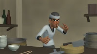
Hello guys and gals,
During the month of August, everybody at the 11 Second Club was Kung Fu fighting, animating as fast as lightning!!
Now, the 11SC blog can finally bring you an interview with the competiton's monthly winner, Pairatch Lertkajornwong! His animation on the Kung Fu chef was beautifully executed and introduced something unusual with use of slow-mo!
I wish to thank Pairatch for his time and I hope you all enjoy the interview. If you wish to leave any thoughts, please feel free to use the comments section of this post. Thank you!
Through martial arts, Bruce Lee spent his entire life searching for new ways to explore self expression. I believe his philosophies share a big relationship with animation. For each of first my next two questions, I wish to first share a Bruce Lee quote and then ask a question related to it.
The first quote:“Don't fear failure. — Not failure, but low aim, is the crime. In great attempts it is glorious even to fail.” How often do you experiment with new ideas at the expense of playing it safe?
I am an open-minded type of person. I love to try new things and keep myself open to everything and everybody. At work, I always try a new workflow that I have learned from another animator. When I see a cool shot that I like, I tend to find who produced it, asking questions about how to accomplish something similar.
I think since I have began learning animation, I have always known the importance of having a good workflow. I tried many, trying to find one is the most powerful for my needs. Examples include layering animation, pose to pose, 2D planing, Straight Ahead. I must admit I am yet to find what I believe to be the best. I have realised however, that many times that my animation can suffer from a poor choice in workflow hurt myself, yet I understand that each has its own style. Its a matter of chooosing the right one at the right time.
I still hope to learn from others as much as I can and remain hungry and ready for new things all the time.
(This old showreel shows the range and contrast in Pairatch's work. Also please feel free to visit his youtube channel, by clicking here)
Second quote: ''It has always been very easy for me to put on a show and be cocky, and be flooded with a cocky feeling and feel pretty cool and all that. I can make all kinds of phoney things. Blinded by it. Or I can show some really fancy movement. But to experience oneself honestly, not lying to oneself, and to express myself honestly, now that is very hard to do.'' There is a big difference between simply move a rig and acting, in order to create the illusion of life. Would you like to expand on this?
I want to reach the level where I'm able to give the life to character more than just make him move. Believe me, I try so hard to do that, but I'm just a little animator and have so many more things to learn and experiment with. I still have a long way to go to reach that level.
For me I think it's very fantastic thing that you can make a simple polygon character move, make him look alive and make him look like he is the one that has a heart and mind. That it can catch the audience's imagination. If the character can catch the audience and make the audience feel with our character, that's awesome. The fun part of animation is hearing feedback that your work is liked or that they are happy with what you have produced.
When you realized you wanted to get into animation, how did you go about learning?
I began by teaching myself. I watched animation a lot and tried often to make it look like what is on screen. You can say sometimes, I copied it. I tried to learn this way for a while, until I met Jinanavin (Keko). I then studied animation at his school.
After that my methods of learning changed. I started to learn traditional techniques such as keyposes, breakdown, slow-in and slowout. I learnt the way that a classical animator would work and was introduced to the workflows of some of the best animators. The best thing is Keko's school is like a center that Thai animator can come together and meet. That means we have the opportunity to exchange some of ideas and experience about animation from this place. This is where I really started to learn and now I'm taking a class at iAnimate school. It's super fun!!!
What sort of things do you really enjoy animating?
Actually I'm very new in this industry. So every type of shot is still exciting. I find inspiration in everything. I really want to try to learn a super-cartoonie style because it looks extremely fun and I think it can challenge me. I love the way that everything is exaggerated. I remember watching Cloudy with a chance of Meatball for the first time. I see the trailer on my friends computer that he wearing headphone so i dont hear any sound but that trailer make me laught out loud because how freaky that character move is super funny and unpredictable.
Please talk about your animation process.
Pairatch working out a pose
I separated the process into two parts. The first part is the dailogue part that I worked upon like nost animators do i.e. Blocking keypose/Breakdown/Spline/Polish.
In the second part I work on the beats of the action, and a big thing for me is the rhythm of the shot. I tried to find a good rhythm and how the action flows throughout the shot by taking reference material.
The way I look at reference is that it of course starts in normal speed. For this animation, my real life reference is super slow, because I can not act like Kungfu Chef. So I then go to edit it in After Effects to work out a good timing. I also rough thumbnail it and animate with simple box polygons in maya, to see how it work. Through this method I am just trying to find the rhythm, which would be defined further through blocking keyposes. When it all works together, the poses should tell you the beat and rhythm clearly.
I'm not strict to body mechanics in my video ref because I know it looks bad for me. I just want to find a good actions that are interesting and flow. I want to see a lot of motion in a short time. I tried testing this shot ten times in one day to get it right.
(note the original pose that throws the bowl with one hand. This was changed to strengthen the idea)
After I have finished blocking the movement and everything works the way I would like, I put in breakdowns and then spline it.
In Dragon: the Bruce Lee story, the young martial artist is working in a Chinese restaurant, when he becomes involved in a fight with some of the staff. Is this where the idea came from? If not, what else inspired the scene?
restuarant at Pairatch's house
The thing is my house is a restaurant, haha, which is the reason why when I heard this dialogue for the first time, I instantly started thinking about cooking. Through the idea I wanted to involve some object interacting, because I think interacting with a prop in your scene looks interesting. If you've seen my shot you will see a lot of interaction.
I tried to place the chef in some business like chopping some vegetables and then use the props and his placement in that environment to create a story.
I must ask the slow motion part. How did you plan out its timing? Also how did you keep control of composition with so many objects within the scene?
First I have to tell you that before I started working on this part, I had no idea about how I was going to make it look cool. My workflow for this was a kind of experiment. I tried to thumbnail and draw eveything. I also made the last composition first, which is the part that audience will see most see a lot first, before animating backwards to see how it worked.
I tried to tweak things as much as I could, because I felt when everything is set still at the start is of less importance to the audience and they wouldn't feel too much about it. The slowmotion part is where the entertainment happens, so this is where I spent the time. This workflow was good for me!!
Staging of the shot. Look how everything leads to the chef
Please talk about your use of different beats and rhythms.
Actually I thought about 3 speeds in my shot, but I wanted to make it super contrast. I have a normal speed, super slow speed and superfast speed. With the beat I thought about motion of the character first and then I animated the objects to this beat so everything will flow smoothly.
I tried to avoid action that would flow only forward then back, then forward the back, but instead break it up. This was one of the first thoughts when planning.
With so many other great winners choosing to render their 3d entries, was it a conscious choice to use limited lighting?
Actually I planned to spend one day for rendering, but I had a problem about the scene setting. I am also not that good at rendering so I wanted to choose something would could be made quick, but still look good. I asked friend who is good with rendering if there was a way that looked nice, but wasn't too complicated and the best answer is viewport 2.0 . I very happy with the result, you just put some light on your scene and it needs a couple of minite to render your work. That was awesome!!
Ken and Barbie
At the beginning of your eCritique, Dana Boadway Mason, mentions she was inspired to pursue a career in animation after watching the film, Toy Story. Dana liked the idea that an animator wasn't limited by their own body, but instead she could be any character. If you had the opportunity to animate any character from Toy Story, human or toy, who would you choose and why?
I actually want to animate the barbie couple, haha! They are super funny and make me laugh in every scene. I love the way they move. It is very unique and I think it looks easy but would be super hard to animate. Actually, I would love to animate any character in that movie. Just in case, Pixar hiring me, haha!
In your eCritique, Dana suggests pushing the chef's arcs and poses, while also squash and stretch in some areas of your clip. Please share your thoughts upon this.
Dana Boadway Mason's eCritique
Yes I totally agree with her suggestion. and you know what, I didn't think about it much when I was working on this piece. Maybe, because I just concentrate a lot on spacing and the amount of detail, so I didn't get an overall feeling. That's not good. Her suggestion helped me a lot and reminded me that I have to give an eye on the overall feeling of a shot before going deep into the detail.
Talk about any new concepts you were introduced to (or re-introduced to) through the eCritique.
One thing that stood out, that I remember and totally agree with Dana to pushing the chef's arcs and poses, while also applying some squash and stretch too. It was like wow !! Why did I forget that?
I always try to look into adding those little details like how he settles into this pose and also spacing. I always track some spacing and try to make every spacing look good, but the thing is, if you cannot make the overall feel of your work look right. the little details do not mean anything. This is because I believe the audience see the overall feeling is most important. I don't mean those little details are not important, but your first priority should be the overall feeling.
Is there anything you'd like to add about your thought-process or experience in August's competition?
I learned a lot from this piece, but the most important thing for each animator is to have calm when you working. Do not rush! For example, this shot, for me, is very complicated one and has a lot of things happening in a variety of technical ways: You have to concern yourself with how constraints, then there's IK/FK witching on the arms. You also have to manage the entertainment value of the shot.
The thing I would like to tell you is to be calm. Don't go to spline curve too fast if you not sure that its going to look good. If you go too fast you will work more slowly at the end. When you spline too early, you have to solve a lot of problems and make a lot of extra work. So I think concentrate on the each image and make sure that the frames will work well, before you get down to work on the graph editor.
What advice would you offer to someone who was just starting their animation education?
I think a good tip is to watch a lot of animation. It is very helpful. Actually watching any kind of movie is very useful, but try to pick the good ones. I think if you watch a lot your eye and your brain will remember a good thing from that movie, which will help make your natural sense for animation stronger. If your natural sense for animation is strong, then when you go to study animation, it can help lead to good things. For me, your eye is the most important thing. The better your eye and judgement, the more confident you will feel in achieving your desired result.